Mobile application for fashion store
Brief
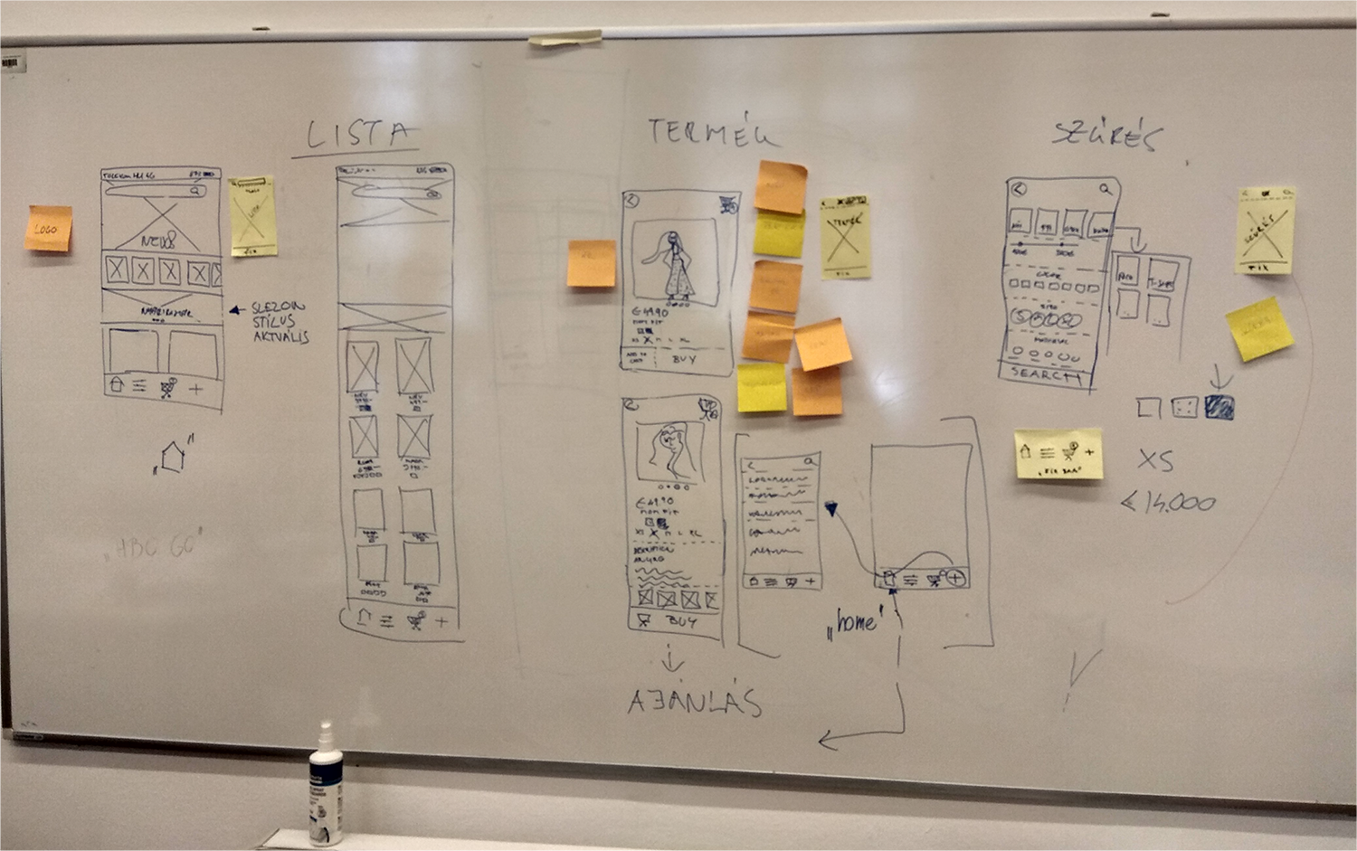
At the UX Bootcamp, hosted by Xlabs, we have been challenged to create a mobile app for a fashion store and to create three screens for the app: the main page/list view, product view and the filter view. Our project team consisted of four people and focused on brainstorming and sketching low fidelity wireframes.
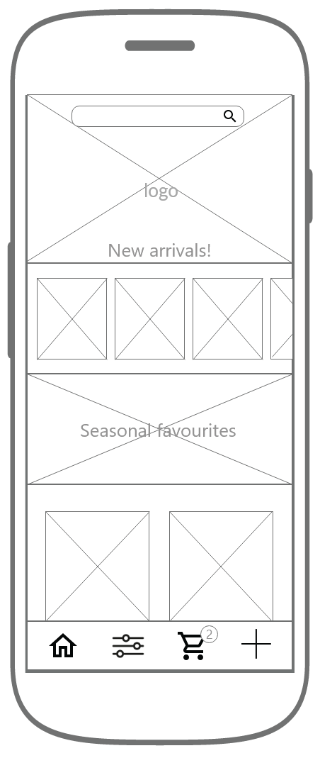
After that I continued with the digital wireframes and the UI design.
Tools used:

UX Design
We started sketching our ideas about the task examining similar mobile applications that exist in real life. Our aims were to design an eyecathing homepage, to make browsing as mobile friendly as we could and to design a convenient and plain filter screen.
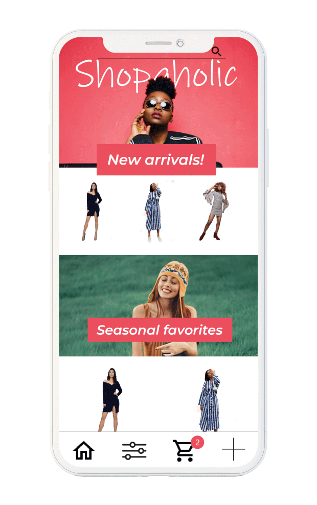
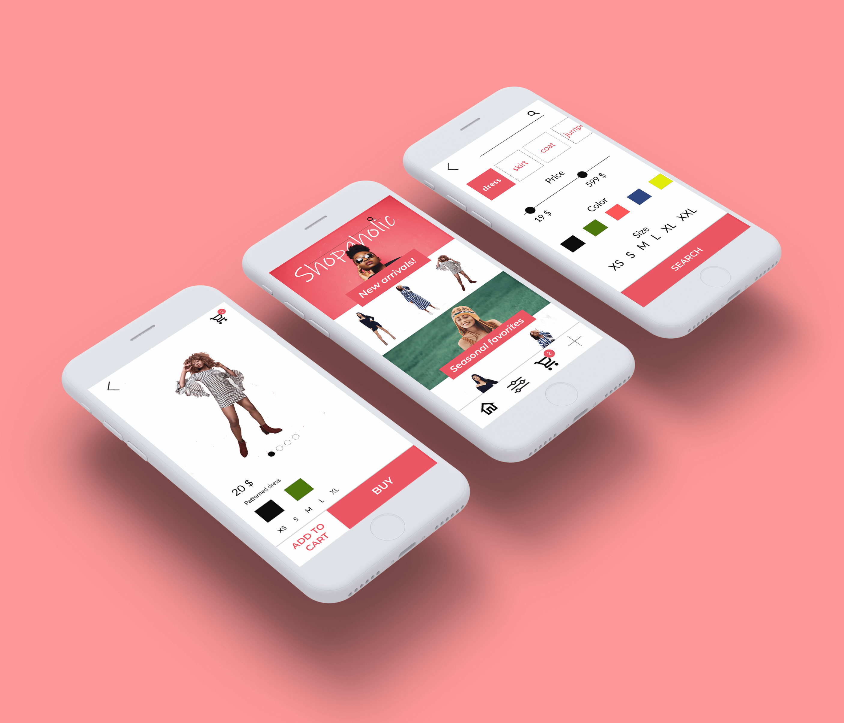
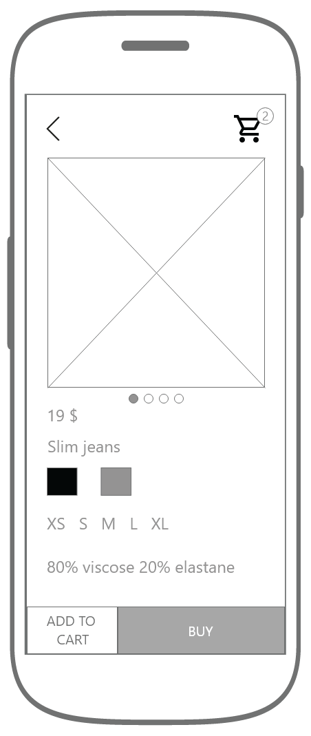
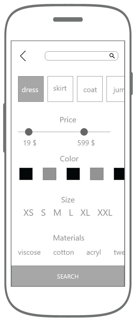
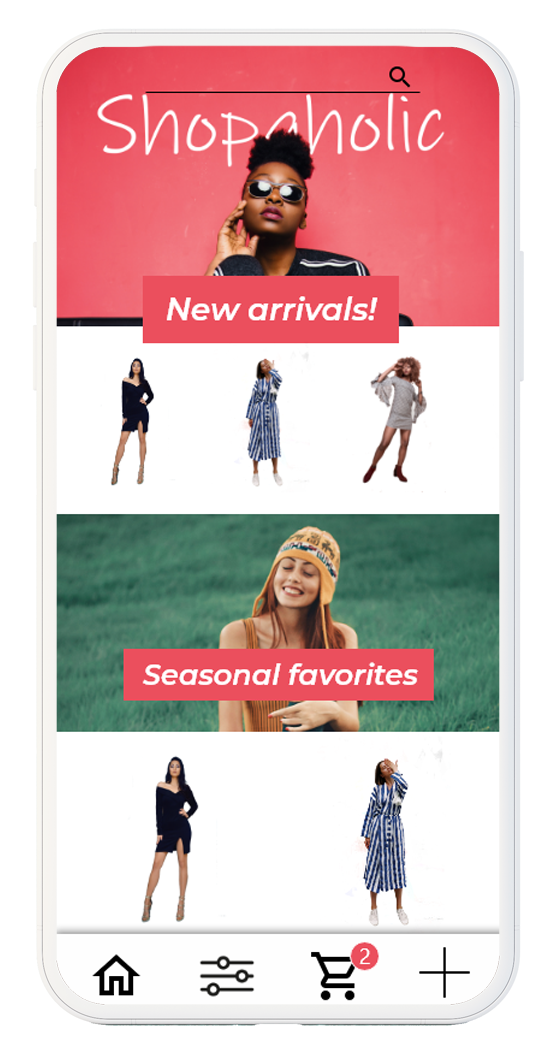
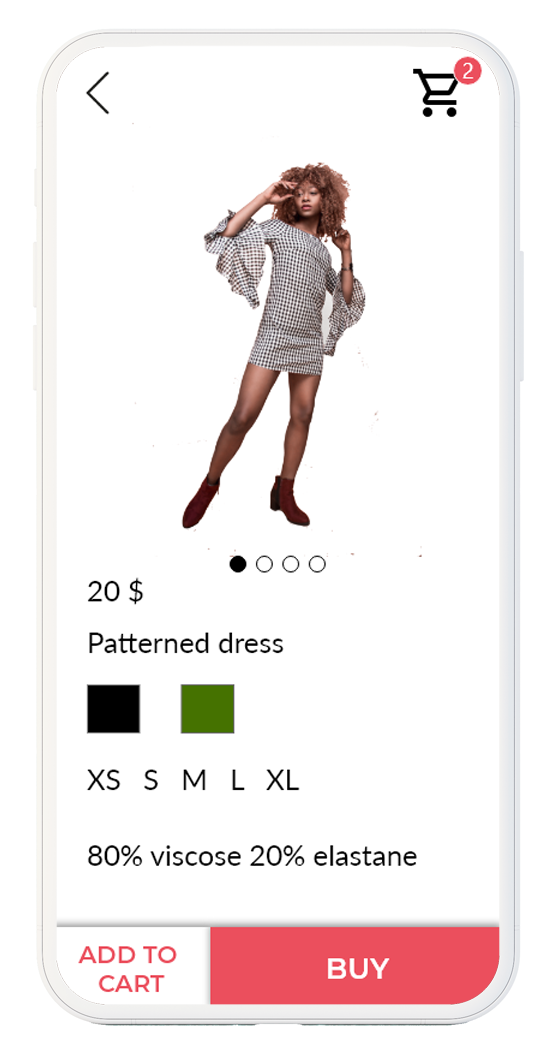
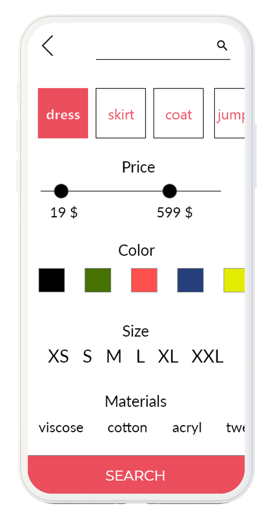
The first screen (left to right) features the main page, the first users see when browsing the app. Our team decided that the app should have a tab bar at the bottom with the main functions of the app. From left to right the user can access the mainpage, filter, cart. The plus symbol opens other functions like settings, contact…etc. New arrivals at the top can be swiped to see more new clothes. Scrolling down would reveal seasonal favorites. The second screen features the product view with all the important informations about the product like price, name, avaible colors and sizes…etc. Scrolling down would reveal additional details like materials. The tab bar at the bottom divides in two call to action buttons, like add to cart and instant buying the product. The third screen features the filter view. There’s a search bar at the top if the users would like to type. The main clothes categories have a tile like carousel mechanism and users can swipe to see more categories and tapping one would select that category. The price section has a slider to controll the price range. Otherwise big types and block were used to make tapping more easily. The call to action button at the bottom can be hit if the user decided what to look for.
UI Design
I selected a bold hero image for the top and made a handrawn logo for the fashion shop which I named „Shopaholic”. Fashion apps tend to have simple, minimal design with almost no colors, only black and white. Yet I choose a warm coral color for the call to action buttons to be more noticeable otherwise I tried to keep the design as simple as possible. Lato font was used as it is easily readable and a sans serif font suits the design more.
Final Design