Landing page for a Wine Webshop
Brief
At the UX Bootcamp, hosted by Xlabs, our task was to design a landing page for a wine webshop. Our project team consisted of three people and focused on brainstorming, creating user persona, designing navigation and sketching low fidelity wireframe. After that I continued with the digital user persona, wireframes and the UI design.
Tools used:

Process
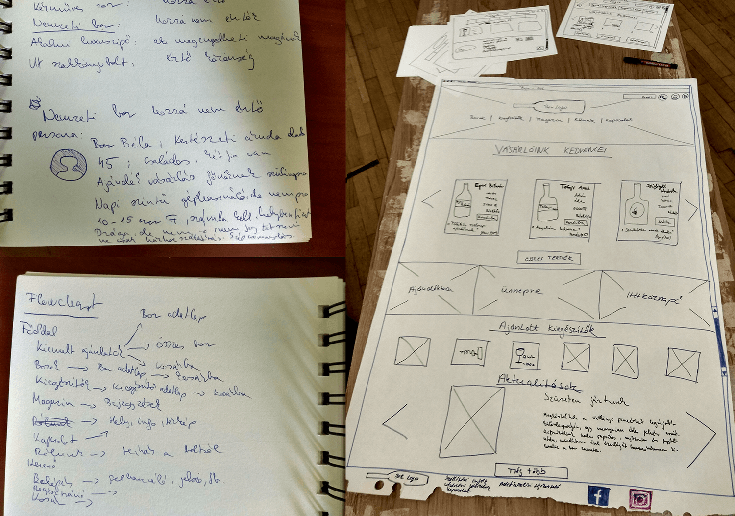
We started sketching our ideas about the task examining similar wine store’s pages that exist in real life. Usually two types occur: very minimalistic storeage like webshops and more friendly wineries. We decided to go on the latter path and sketched a scrolling landing page for a small family business.
User persona
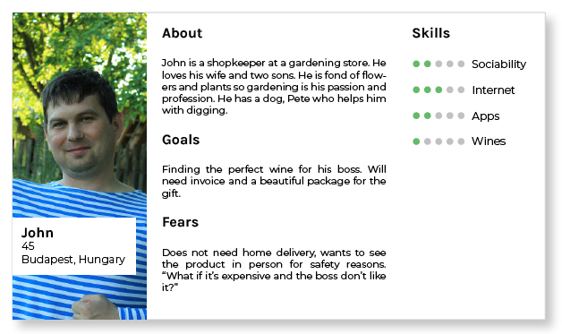
The first step we created a user persona to cover one type of the hypothesized customer. John is a bit shy but kind man who has been given an important tast – he has to buy a fine wine for his boss’s birthday. He is not an expert and want to do the job as quickly as possible.
UX Design
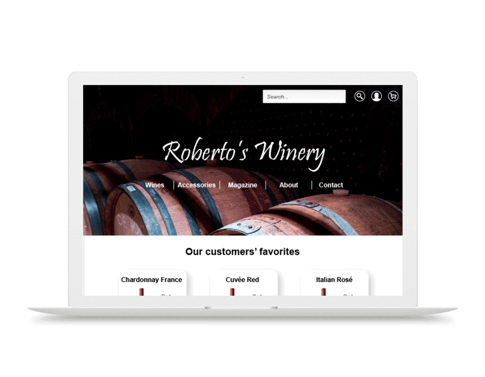
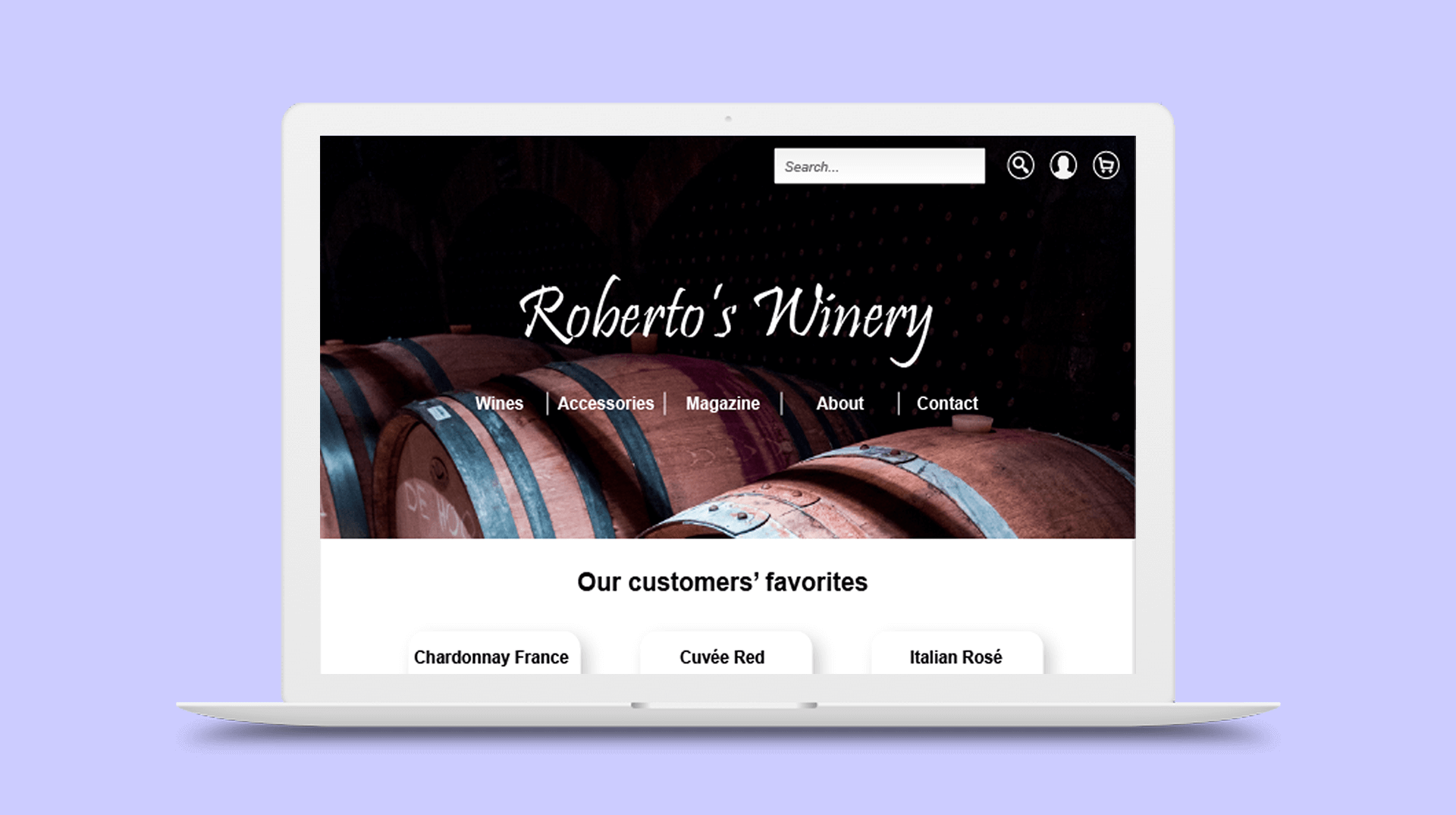
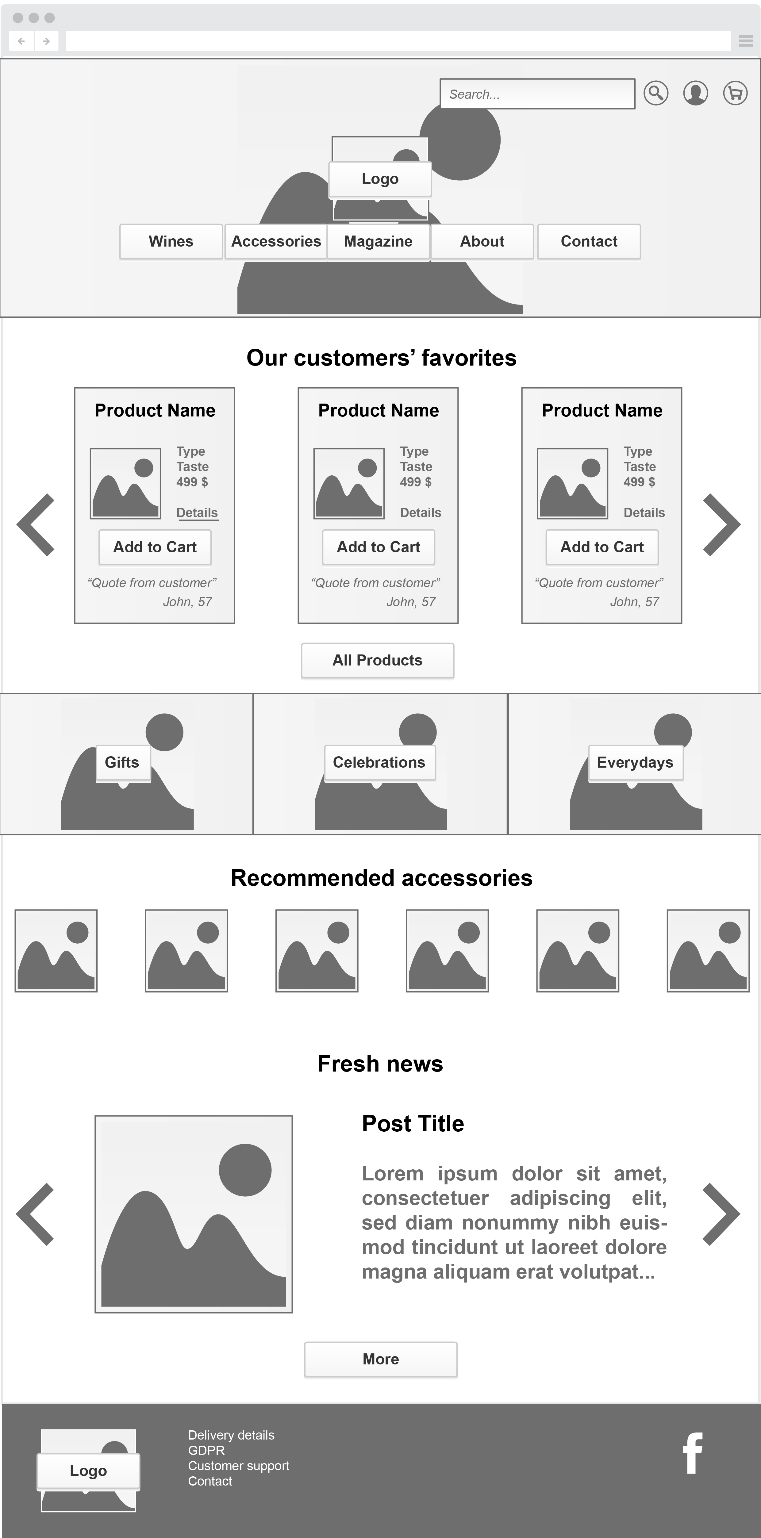
The second step we created the user flow chart and sketched the wireframe for the main page. The page starts with a bold image and important menu options like wines, accessories, magazine, about and contact. After scrolling, favorite picks from other users will be seen in card formats with some necessary informations. The products have quotes from buyers to give a more realible feeling for users and clear call to action buttons. Then comes a tile styled section where users can reach products are organised by special events. After that comes a carousel with recommended accessories. Scrolling down to the bottom would reveal fresh blog posts from the winery and other informations about online delivery.
UI Design
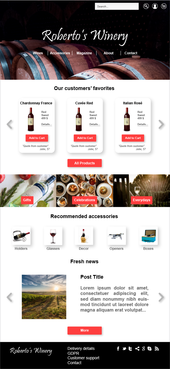
I selected a dark themed hero image for a more professional look and made a rough handrawn logo for the winery shop which I named „Roberto’s Winery”. It gives a bit vintage effect which is very popular for wineries. I tried to keep minimal with types and let the images do the bigger impact. A warm coral color was picked to give call to action buttons an awarness raising yet not harsh feel.
Final Design